
By: Tunji Okunlola
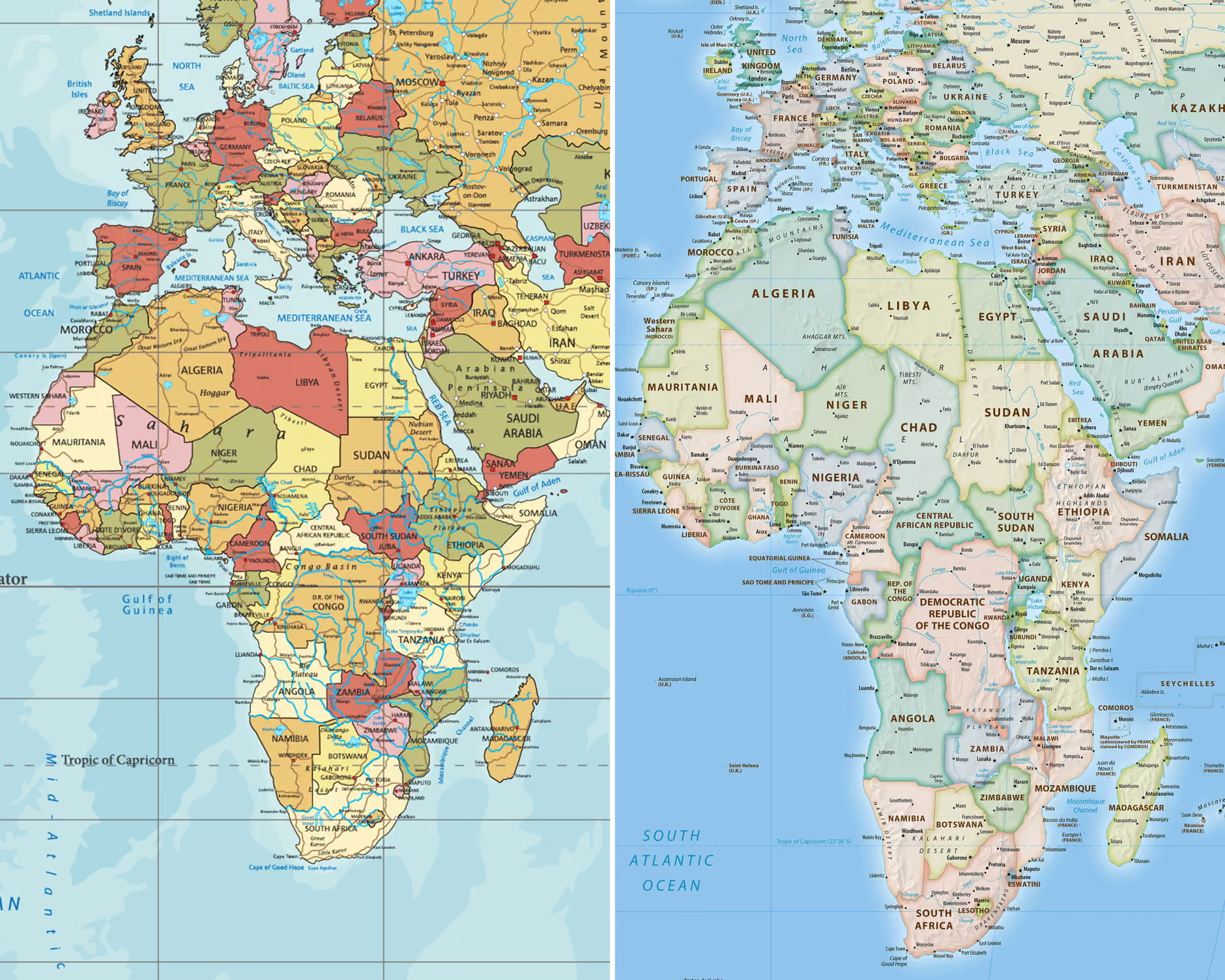
Left: Africa on the traditional world map based on the Mercator projection, and on the Right: on the 2018 Equal Earth map. Composite: equal-earth.com, Getty Images via Guardian
For generations, the world’s most familiar map has done Africa a disservice by flattening the continent’s true scale despite its vast landmass.
That distortion is back in the spotlight after the UN General Assembly reportedly moved to endorse a measure encouraging governments, schools, media outlets and institutions worldwide to adopt the Equal Earth projection instead, a version said to more faithfully depict how the world’s landmasses compare in size. The non-binding measure was said to have been put forward by Togo on behalf of the African Group, with African Union backing.
Titled “Correct the Map: Rebalancing global cartographic representation and promoting equitable representation of the world’s regions, particularly Africa,” the resolution pushes for broader use of Equal Earth-style projections in contexts where relative size actually matters – though it stops short of banning Mercator or mandating a single alternative.
Gerardus Mercator, a Flemish cartographer, devised his now-famous projection in 1569 to help sailors navigate. It’s excellent for preserving shapes and compass bearings, but it comes at a cost: landmasses near the poles balloon in apparent size, while those near the equator shrink.
The result is a world where Greenland looks nearly as large as Africa despite Africa actually being roughly 14 times bigger. Europe and North America end up visually inflated, while Africa, Latin America and swaths of Asia are shortchanged.
Equal Earth, developed in 2018 by Bojan Šavrič, Tom Patterson and Bernhard Jenny, takes the opposite approach: it’s an equal-area projection that preserves true relative sizes while keeping shapes reasonably recognizable. Under this version, Africa balloons to its rightful scale, while Greenland, northern Europe, Russia and parts of North America shrink back down to size.
The continent covers somewhere around 30.3 to 30.4 million square kilometers. By that measure, Africa trails only Asia in size, and comfortably outsizes:
- North America (~24.7 million sq km)
- South America (~17.8 million sq km)
- Antarctica (~14 million sq km)
- Europe (~10.2–10.5 million sq km)
- Australia/Oceania (~8.5–8.6 million sq km)
That makes Africa roughly three times the size of Europe, about 1.2–1.3 times North America, nearly double South America, more than double Antarctica, and over three times Australia/Oceania. It’s also large enough to swallow the contiguous United States, China, India and much of Europe combined, with room left over while Greenland, by contrast, is only about a fourteenth of its size.
What happens next
Supporters are framing the vote as a long-overdue correction to a bias with real educational, cultural and geopolitical stakes. Togo has already begun updating its school geography materials, and France has reportedly pledged to move away from Mercator.
The US, which is said to have opposed the measure, argued it pushed an “ideological agenda” and pulled UN attention from more pressing global issues.
Because the resolution carries no binding force, whether it changes anything in practice will come down to voluntary buy-in from governments, schools, publishers, media organizations and tech platforms.
Discover more from CLARITYNEWSNG
Subscribe to get the latest posts sent to your email.

